Deprecated: strpos(): Passing null to parameter #1 ($haystack) of type string is deprecated in /www/collab365_296/public/wp-includes/functions.php on line 7025

Deprecated: str_replace(): Passing null to parameter #3 ($subject) of type array|string is deprecated in /www/collab365_296/public/wp-includes/functions.php on line 2162

Deprecated: Hook imagify_allow_picture_tags_for_webp is deprecated since version 2.2! Use imagify_allow_picture_tags_for_nextgen instead. in /www/collab365_296/public/wp-includes/functions.php on line 5758
How to do conditional formatting in Power BI Column Charts - Collab365
Deprecated: strstr(): Passing null to parameter #1 ($haystack) of type string is deprecated in /www/collab365_296/public/wp-includes/functions.php on line 1145

Deprecated: stripos(): Passing null to parameter #1 ($haystack) of type string is deprecated in /www/collab365_296/public/wp-includes/functions.php on line 1152

Deprecated: stripos(): Passing null to parameter #1 ($haystack) of type string is deprecated in /www/collab365_296/public/wp-includes/functions.php on line 1155

Deprecated: strpos(): Passing null to parameter #1 ($haystack) of type string is deprecated in /www/collab365_296/public/wp-includes/functions.php on line 1162

Deprecated: strpos(): Passing null to parameter #1 ($haystack) of type string is deprecated in /www/collab365_296/public/wp-includes/functions.php on line 1165

Warning: Undefined array key "url" in /www/collab365_296/public/wp-content/plugins/thrive-visual-editor/thrive-dashboard/inc/smart-site/classes/class-tvd-smart-shortcodes.php on line 85

2019-01-03

For many companies, January is a month of reporting how well the previous year did or didn’t. In this post, I will walk you through a very simple method of adding conditional formatting to a column chart. Adding colours to indicate performance is a very quick method of giving a clear message.

Adding Conditional Formatting

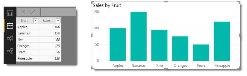
For this post, I am using a basic table of fruit and total sales, which when plotted on a column chart gives a simple chart. We are going to change the chart so that the columns greater than the target are one colour and those greater than the target are another colour. 

simple data

These instructions assume you have already loaded the data into the report.

Step 1: We are using a very simple target of one value for all fruit. We start by saving that value in a measure called Sales Target. 

From the Modelling or Home ribbon click New Measure and enter:

Sales Target = 100

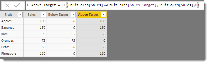
Step 2: The next step is to add 2 columns to the fruit sales table one for Below Target and one for Above Target. It will split the numbers into 2 columns. 

From the Modelling Ribbon click New Column and enter the following:

Below Target = IF(FruitSales[Sales]<FruitSales[Sales Target],FruitSales[Sales],0)

Add another column with the following:

Above Target = IF(FruitSales[Sales]>=FruitSales[Sales Target],FruitSales[Sales],0)

The difference between the two columns is the operator, first, one is < less than the target and Above is >= greater than or equal to the target.

2 columns added

Step 3: Return to the report canvas and add a stacked column chart.

  • Add Fruit to the Axis
  • Add Above Target and Below Target to the Value
  • I also sorted by Fruit Ascending to get the order.

Formatted Column chart

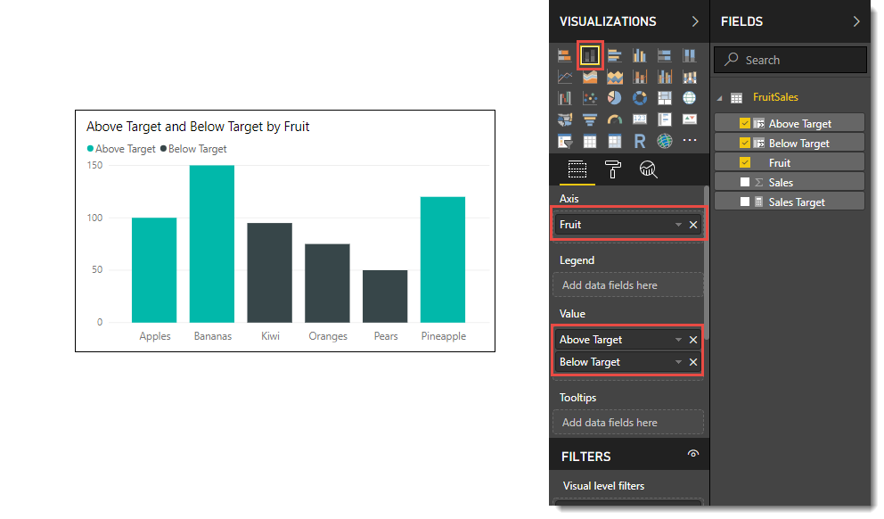
Without any more ado, the columns are in 2 colours based on the measure.

Conclusion

This very simple trick I used to teach in Excel and was surprised it was needed in Power BI, but it works well. I hope your January reporting goes well. I will do a more complex variation of this later in the year that includes individual targets that can be time-based.


(Visited 1,214 times, 1 visits today)

About the author 

Laura Graham-Brown

SharePoint Trainer, Consultant and Agony Aunt

Summit Bundle

Get 200+ hours of Microsoft 365 Training for 27$!

Master Office 365, Power Platform & SharePoint & Teams With 200+ Hours Of Training Videos and 108 Ebooks in the Collab365 Academy. This offer is insane and is only available for a limited period.