
i have upgraded to sharepoint 2013 from 2010 – my top navigation bar in 2010 was over 2 rows as can be seen in this image…

on the update – i appear to have all my navigation in 1 row and this means it goes off the screen and the users need to scroll right to select. see image below….
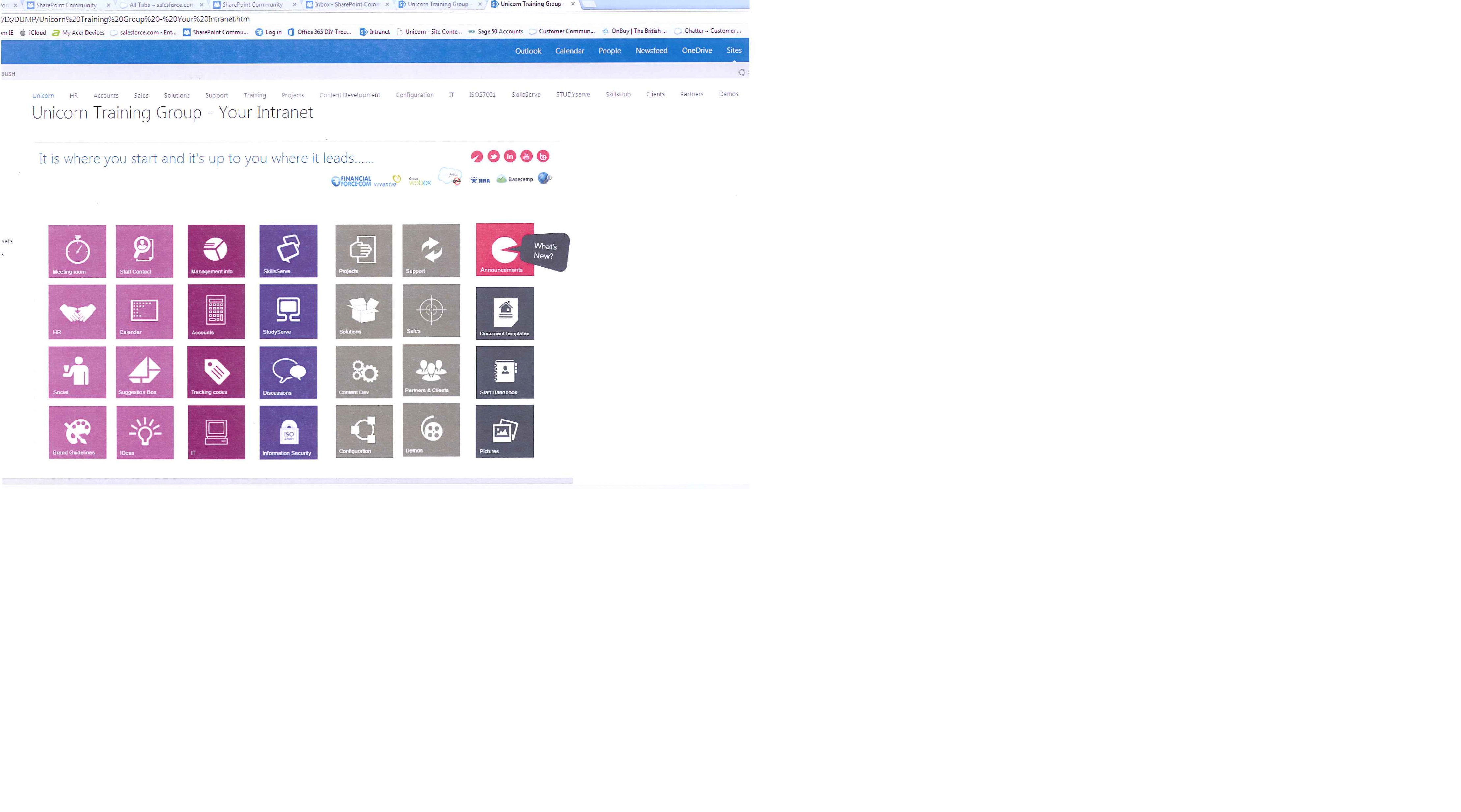
can anyone point me as to how i can correct this.
?width=750
hi
you can goto settings and goto navigation there you can see global navigation and you can modify there .
thanks
swaroop
Wow that’s a large navigation bar. Why don’t you implement a mega drop down menu which will look nicer and allow you to organise the menu items a bit more logically?
Check out Stefans post to see how this can be done.
If you don’t want that then you are into the realms of playing around with the SP CSS…